The right data visualizations can provide powerful analysis and actionable insights. Tools like Tableau enable developers and their audiences to explore, analyze, and present their data in new ways. These innovative approaches to data visualizations are eye-catching and often powerful in telling the story of the data and subject matter, but can sometimes sacrifice ease of use. It’s important to design visuals to meet the needs of the user without leaving them confused, frustrated, or turned away by the design. User adoption is key to any analytics program’s success.
Sophisticated, mature data visualization understanding takes time for most business intelligence analysts to achieve. One of the most important factors to keep in mind is data visualizations are intended to engage users and deliver insights for business transparency. These actionable takeaways, lessons, and “ah-ha!” moments are the lynchpin for successful deployment and ROI.
So, with those principles in mind, a data analytics practice should be built on a set of core data visualization best practices:
- Don’t overload the screen.
- Be respectful of color and the color-blind.
- Don’t leave users guessing.
- Compartmentalize dashboards layouts for ease of use.
- Filters are your friends – pick good ones and call on them often.
Note: I’ve developed the below sample visualizations and dashboards using public data from the State of Florida Department of Education. I recommend you refer to this previous blog post to understand how Tableau Prep can be used to combine and prepare the data as a first step. Data preparation is vitally important as it provides a solid foundation for any analytics practice.
DON’T OVERLOAD THE SCREEN
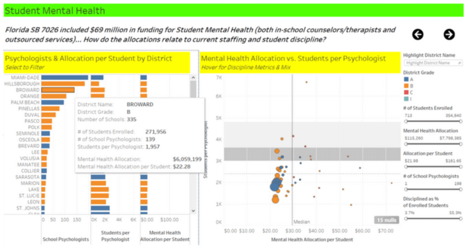
In the example above from our analysis of Florida Public School Safety & Mental Health, the bar chart worksheet on the left has three measures for comparison. The tooltip includes several others (number of schools, number of students, and mental health allocation), but those are not being visualized. It’s important to pick the most important metrics to present, and provide alternate sources – whether it be tooltips or other dashboards – for secondary data points.
BE RESPECTFUL OF COLOR AND THE COLOR-BLIND
Color is an intrinsic aspect of data visualization; it is imperative to use color properly. This can be a challenge given both the nature of your data as well as the preconceived notions and “requirements” within your organization, but it is a challenge normally worth fighting. A few key points:
-
-
Keep your color palette simple and limited to eight colors or less, as the human eye has a hard time discerning many shades of many colors. This may limit which dimensions you use on the color card, or lead you to alternate designs to better present those dimensions. In my humble opinion, every state, product category, or sales district shouldn’t have it’s own color! In the above example, the four school district grades are colored simply.
-
Shy away from “green is good, red is bad” visualizations – unless different shapes or text are also used as an alternative to aid the color-blind. Red-Green combinations are very difficult, if not impossible, for the color-blind to decipher.
-
Be consistent across worksheets and dashboards within a workbook. Ensure the same colors mean the same thing – otherwise, users will be confused, frustrated, and turned off.
-
DON’T LEAVE THE USERS GUESSING
As shown below, clear directions should be stated for users to understand the functionality of each worksheet within each dashboard. By having the ability to sort on the Students per Psychologist column, it enables a different perspective and yields potential insights greater than the default sort (the School Psychologist) count. When hovering on the scatterplot, it provides additional metrics and a viz-in-tooltip for Discipline. Worksheet titles or other text should be used to give users guidance, otherwise, they may miss these capabilities and fail to grasp key insights.
COMPARTMENTALIZE DASHBOARD LAYOUTS FOR EASE-OF-USE
Just as organized chefs have a place for each tool in their kitchen, efficient analysts, executives, and other visualization consumers need a clear view of their tools. Dashboards can be powerful assemblies of analytics capabilities, but they can be overwhelming to even seasoned professionals. We recommend segmenting their layout with the use of clear titles, color shading, and guided analytics navigation. In the below example, the green and yellow highlighting hearken back to our school days while placing the emphasis on these important topics for analysis.


FILTERS ARE YOUR FRIENDS – PICK GOOD ONES AND CALL ON THEM OFTEN
It’s tempting to overload dashboards with a plethora of quick filters for an audience to use at their discretion. Not only can that approach hinder performance, consume screen real estate, and overwhelm users, it can diffuse the value provided by the data visualizations. In the example above, a user is able to pick from a number of filters. This helps to narrow down the visualizations to show data for fewer school districts and students. It is also good practice to order the filters in a way that aligns with users’ common thought processes. These simple adjustments can ensure dashboards are efficient and insightful. In conclusion, these five data visualization best practices can help take your analytics program to the next level. Visualizations can be as pretty as you’d like them to be. However, if they are not tailored to the audience with clear directions, they will not be used and they won’t provide much value for maximum business insights. It’s best for analysts to sit down with business leaders to make sure what’s being built is exactly what they need and enables efficiency.